 FEATURED
Website
IMEAA
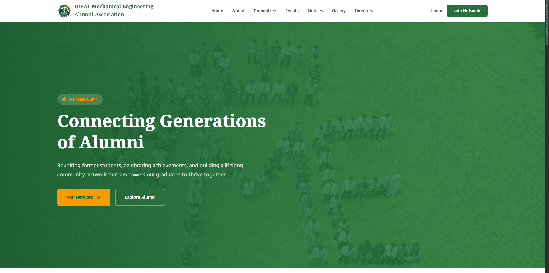
Reuniting former students, celebrating achievements, and building a lifelong community network that empowers our graduates to thrive together.
- AlpineJS
- mySQL
- PHP
View detailsVisit site for IMEAA (opens in a new tab)
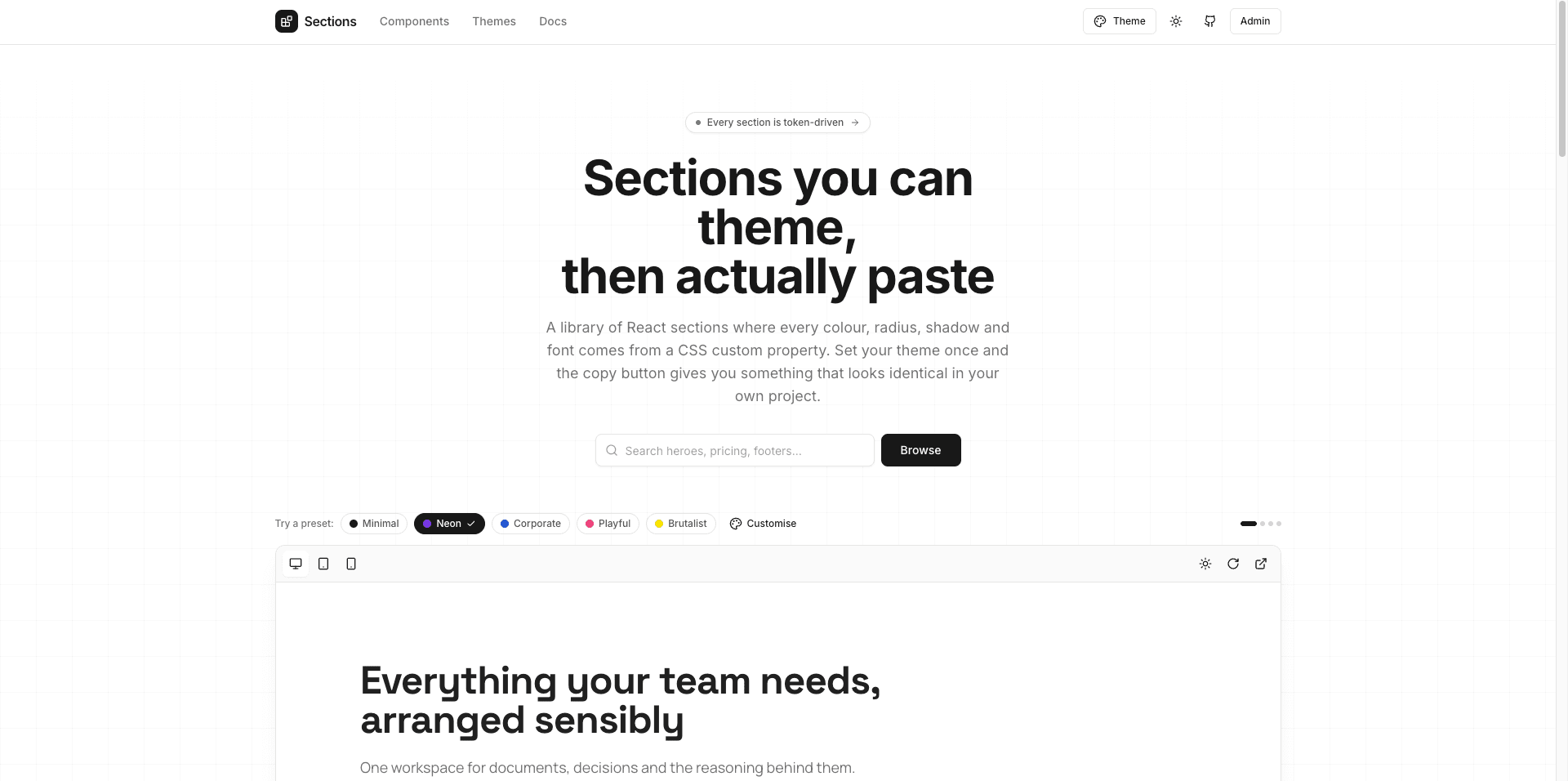
Emon UI is a themeable React UI section library where every color, radius, shadow, and font is driven by CSS custom properties, allowing developers to copy fully styled, ready-to-use production sections that match their custom themes instan
Visit website (opens in a new tab)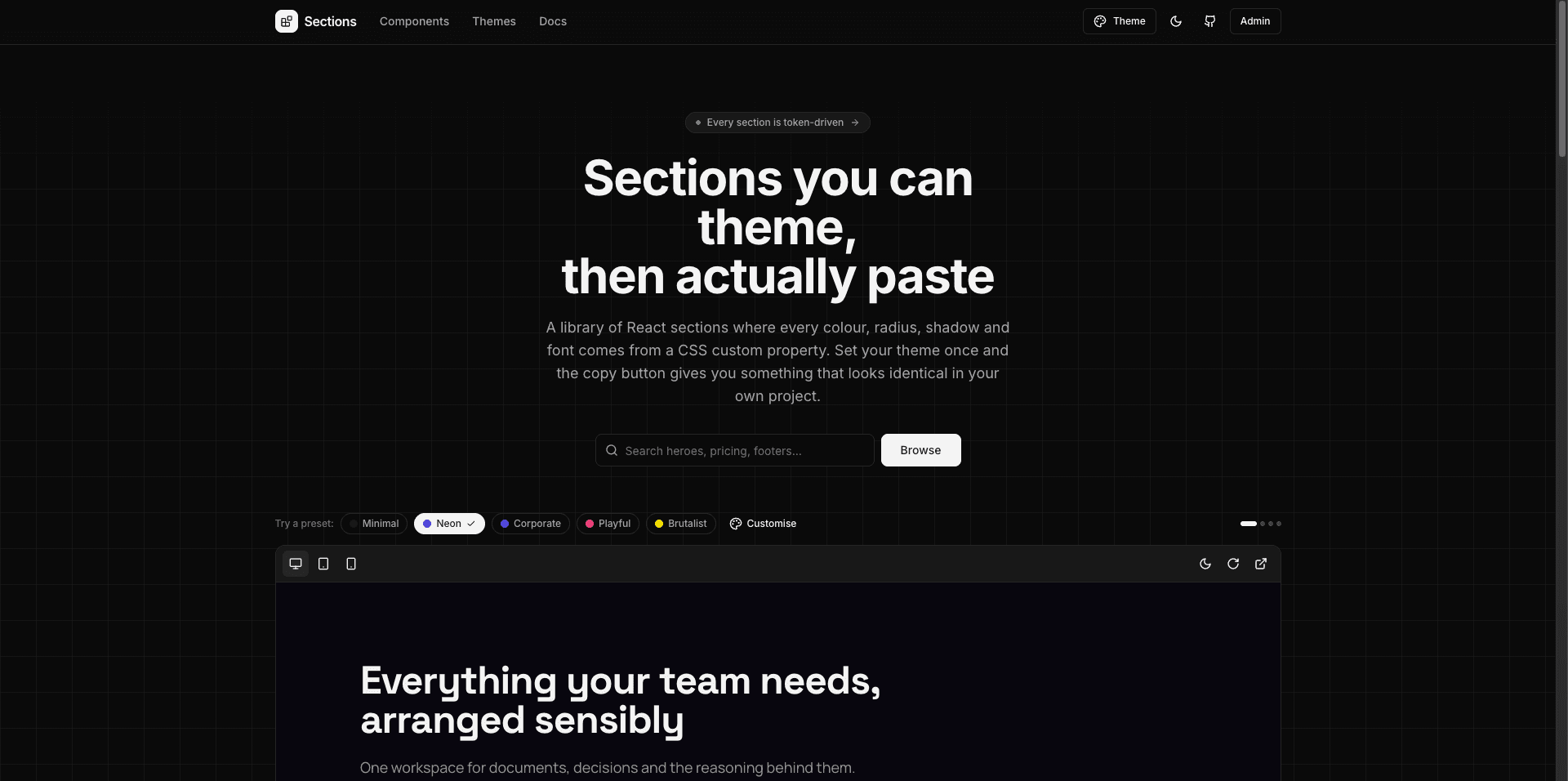
Emon UI is a developer-focused component system bridging the gap between design tokens and production-ready code. Unlike traditional component libraries that require complex installations or hardcoded utility classes, Emon UI provides complete layout sections (spanning 21 distinct categories like navbars, heroes, pricing tables, and galleries) mapped strictly to CSS variables. Creators can preview components dynamically using different built-in theme presets (such as Minimal, Neon, Corporate, Playful, or Brutalist) or custom variables, ensuring that copying a component code snippet guarantees identical styling in their own project without visual drift. It features zero hardcoded colors and strict linting rules to maintain a unified design system.
Every component derives its visual attributes (colors, radius, shadows, fonts) from CSS custom properties—ensuring zero hardcoded colors or styling conflicts.
Easily copy full section component sources along with their respective token stylesheets to paste directly into your project.
Switch seamlessly between built-in visual presets (Minimal, Neon, Corporate, Playful, Brutalist) or define custom token values.
Includes 110+ sections across 21 popular categories, including: Navigation & Headers: Navbars, Mega Menus, Footers Marketing & Landing Pages: Heroes, Feature grids, Testimonials, CTAs, Stats, Logo Clouds Content & Information: Pricing tables, FAQs, Blogs, Timelines/Steps, Comparison tables, Portfolios Forms & Utility: Auth forms, Newsletters, Contact forms, Banners, and Galleries
Built-in viewport toggles allow you to preview components in Desktop, Tablet (768px), and Mobile (375px) views.
Designed with linting rules to prevent inline hex codes, un-allowlisted imports, or Tailwind palette overrides.
 FEATURED
Website
Reuniting former students, celebrating achievements, and building a lifelong community network that empowers our graduates to thrive together.
 FEATURED
Website
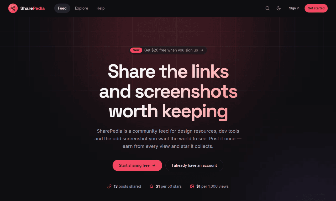
SharePedia is a community-driven feed and monetization platform for sharing useful web links, design resources, developer tools, and screenshots, where creators earn financial rewards based on post views and community engagement (stars).